A monochromatic kitchen – using just one color with its tints, tones, and shades – can be perceived as boring if not designed with careful consideration for texture, depth, and visual interest. The key is to play with variations of the same color, incorporate a wide array of textures, and use accent pieces that add instant personality and character to your culinary space. A single palette tends to age well and feel sophisticated, meaning it’s less likely to go out of style compared to bold, trendy combinations. You can still add personality through textures, finishes, and accessories.
Even if it’s common for architects to design black or white monochromatic kitchens, it’s possible to use almost any color to formulate the optimal layout, leveraging their infinite tones, undertones, and shades. Blue can be an excellent choice. It’s calming and refreshing, creating a peaceful, clean vibe that works marvelously with wood, marble, brass accents, and stainless steel. Blue kitchens create a harmonious, single-hue aesthetic that feels both serene and stylish. Making a blue kitchen work comes down to balance, layering, and details.
Here’s how to pull off a monochromatic kitchen like a pro:
Select A Clear Base Tone
A well-executed monochrome kitchen design is easy on the eye, offering a clutter-free look that exudes elegance, tranquility, and sophistication. Achieving this requires careful attention to detail, especially when it comes to balancing tones, textures, and patterns to avoid monotony. Choose one dominant hue – dove gray, dark blue, or crisp white- to establish visual hierarchy and evoke different emotions. Mixing warm and cool undertones isn’t recommended because they compete for attention, creating an unpleasant and jarring visual experience. Also, you should use only one finish to maintain cohesion.
A mood board is an invaluable tool as it helps you see if your ideas fit well together. It can be a physical or digital reference point, and it typically comprises samples of various kitchen elements, such as cabinet doors, flooring, countertops, fabrics, and paint colors. To find inspiration and ideas, search through interior design magazines and online blogs; understanding what you don’t like is just as important as establishing what you do like, so take note of the things you’d like to avoid.
Embrace Streamlined Cabinetry
Contemporary kitchen cabinets, which feature sleek lines, minimal detailing, and a clutter-free aesthetic, will give your space a fresh and orderly appeal. The smooth surfaces allow the chosen color to be the star of the show, making the culinary space feel intentional and sophisticated. Eliminating visual “noise” is key to achieving a clear presentation, so take your time and choose wisely.
Introduce Texture Through Your Backsplash, Countertops, Or Flooring
Texture is essential when designing a kitchen that uses primarily one color or sticks to one color family, preventing the place from feeling sterile. You can introduce texture with a stone countertop that embodies strength, grace, and character or wood-grain laminate, renowned for its longevity and versatility. Plants offer various textural possibilities, not to mention that they provide health benefits like reducing stress, boosting mood, and purifying the air.
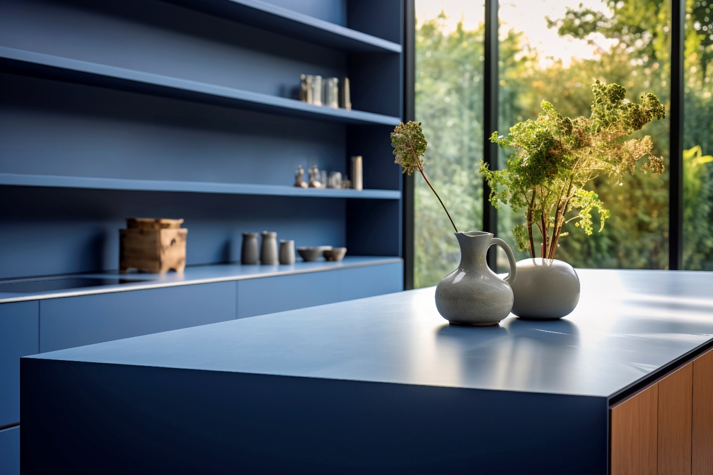
Use open shelving that is the same tone as the kitchen to break up solid masses and display essentials, such as plates and bowls, glassware, and mugs. You can inject a sense of personality into this style with playful accents that reverberate around the culinary space, whether it’s a color or a material, to add visual interest without disrupting the unified color palette. For example, you can introduce a single, striking color – e.g., fiery red – via a small appliance, such as a stand mixer.
Light Your Kitchen
Light and shadow are the main building blocks of a monochromatic kitchen, defining mood and creating a sense of depth and drama. Maximize natural light to expose nuances in your base tone with glass windows and doors that create a bright and welcoming environment. While curtains can soften the hard lines of the kitchen, they effectively detract from sunlight, especially those made from thicker, denser materials. If you need a window covering, roller shades offer superior light control and make the kitchen timelessly elegant.
Keep the ceiling plain to extend your single, unified canvas. A decorated ceiling would break up this continuous line, drawing attention away from the simplicity central to the monochromatic style. Hence, use single-bulb pendants or recessed downlights. Most people use them above the kitchen island, but you can also install them over the dining table or breakfast nook. A plain, uninterrupted ceiling is particularly beneficial in a smaller kitchen where maximizing the feeling of the space is of the essence.
Add A Living Element
Adding living elements like plants or even small water features helps soften the kitchen’s hard, sterile surfaces, bringing life without color contrast. Herbs, pothos, or spider plants can effectively remove toxins from indoor environments and can inspire more creativity in cooking and meal preparation. Greenery reveals your clean lines and surfaces, making the monochrome look more dynamic. Conversely, flowing water balances the sometimes stark and structured feel of the monochromatic kitchen. A small fountain is helpful in a kitchen that tends to overheat, but consider its placement carefully.
Wrapping It Up
Embracing one color in your kitchen design doesn’t restrict creative exploration but rather amplifies it by forcing you to play with depth and texture. Without multiple colors to rely on, you start noticing shades, tones, and textures you might have overlooked in the past. Narrowing the palette gives you the freedom to experiment without overwhelming the eye, so push your creativity into form, material, and detail. Your monochromatic kitchen stands as a reminder that true elegance often stems from restraint and limitation.
It’s essential to note that a single-color kitchen tends to show dust, smudges, and stains more readily. The exact effect depends on whether you go light, dark, or mid-tone, so avoid pure white, jet black, or very pale pastels and keep open shelving minimal. Be sure to test paint samples in the morning, midday, and evening to ensure your chosen shade remains vibrant.